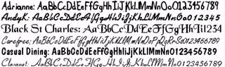
When deciding on what the fonts used within the opening sequence would be, we had to think about where the fonts would actually be used themselves. Instead of taking time to find a font appropriate for both the natural and the unnatural environments within the opening, we decided that the opening credits would be incorporated into the environment somehow, like how the student opening Buckets of Dead Friends writes the title at the end in the blood of the guy who gets shot. For example, in a tribute to a shot in American Psycho, a bottle of pills with the actors names on could be on screen for a couple of seconds.This, of course, leaves us with determining the font for the title of the film at least. We decided that to keep in the tone of the film, set by the opening music and main character's general set-up, the font itself should be somewhat decorative or fancy, whilst potentially still having some dark feeling to it as a sign of madness. We couldn't find an appropriate font so we decided to just go with the fancy outlook, but then we came across Jellyka Castle's Queen, which seems to fit the bill perfectly, with the aspects we were looking for in a font from the start.
Font Name | Preview |
 | |
 | |
 | |
 |
No comments:
Post a Comment